Nodevember: Bayesian Inference On Candy Data
02 November 2020
It’s November, the season of personal challenges and self improvement. In the spirit of this, the procedural generation community celebrate Nodevember, a daily challenge with the goal of inspiring 3D modellers and VFX artists to improve their node-based procedural skills. But you know what else has nodes: Bayesian networks!
So here I present my unorthodox take on Nodevember. Based on each one word theme, I hope to invent a task or explore a dataset using a machine learning model that, at least in some sense, has nodes.
Today’s theme is “candy”. A quick search for a “candy dataset” drew my attention to this fantastic dataset provided by FiveThirtyEight. The dataset is a small but interesting tabulation of information about different kinds of candy. For example, is it chocolaty? Is there nougat in it? How does the cost compare to other candies? Finally, the researchers set up an online survey that asked participants to select their preference out of two randomly chosen candies. More than 8000 participants voted on about 269,000 randomly generated matchups, making this a fascinating sample of what candies people prefer.
Importing the data
The candy data is provided as a CSV file. We can use Pandas to import it. We drop the ‘competitorname’ column since it is unimportant and then convert ‘winpercent’ from a percentage to a value between 0 and 1. Strangely, the ‘sugarpercent’ and ‘pricepercent’ values are not percentages at all and are already in this range.
import pandas as pd
data = pd.read_csv('candy-data.csv')
data = data.drop(columns=['competitorname'])
data['winpercent'] = data['winpercent'] / 100.

print(data)
    chocolate  fruity  caramel  ...  sugarpercent  pricepercent  winpercent
0           1       0        1  ...         0.732         0.860    0.669717
1           1       0        0  ...         0.604         0.511    0.676029
2           0       0        0  ...         0.011         0.116    0.322611
3           0       0        0  ...         0.011         0.511    0.461165
4           0       1        0  ...         0.906         0.511    0.523415
..        ...     ...      ...  ...           ...           ...         ...
80          0       1        0  ...         0.220         0.116    0.454663
81          0       1        0  ...         0.093         0.116    0.390119
82          0       1        0  ...         0.313         0.313    0.443755
83          0       0        1  ...         0.186         0.267    0.419043
84          1       0        0  ...         0.872         0.848    0.495241

[85 rows x 12 columns]
Viewing correlations
Now that we have imported the data, we should have a look at how the variables interact with each other. This is important as we get ready to model the data because it gives us some intuition about which variables might be useful explanatory variables. We’ll use Seaborn to create a relationship plot.
import seaborn as sns
from matplotlib import pyplot as plt
corr = data.corr().stack().reset_index(name="correlation")
plot = sns.relplot(data=corr,
    x="level_0", y="level_1", hue="correlation", size="correlation",
    hue_norm=(-1, 1), height=7, sizes=(50, 200), size_norm=(-.2, .8),
)

plot.set(xlabel='', ylabel='')
plt.xticks(rotation=90)
plt.tight_layout(pad=7)
plt.savefig('correlation.png')
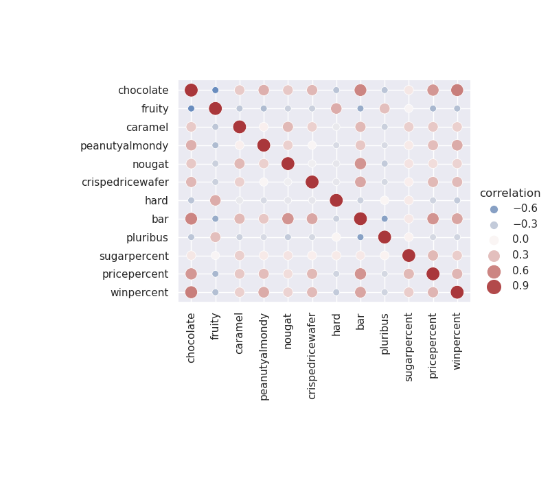
Figure 1: The correlation between variables in the candy dataset.
Taking a look at this plot, it looks like chocolaty candies are almost never fruity, but are frequently found in bars. Also, bars are rarely pluribus. These seem to be sensible conclusions and serve as a sanity check as we proceed to modelling the data.
Bayesian networks
Bayesian networks are probabilistic graphical models that represent the dependency structure of a set of variables and their joint distribution efficiently in a factorised way. They are often used when determining causality is important. They are able to combine both machine learning and domain knowledge, since the first step in creating such a model is to propose a directed acyclic graph (DAG) that links variables in a causal manner. The model is then trained using maximum likelihood estimation (MLE) or Bayesian estimation.
So is a Bayesian network the right model to use for this data? Well, as we will see shortly, not really. But such a model may be able to provide us with some predictive power regardless. Besides, it is Nodevember and DAGs have nodes.
Proposing a structure
We first propose a structure using the NOTEARS algorithm, implemented by the Causalnex package. When learning structure, we can use the entire dataset. Since structure should be considered as a joint effort between machine learning and domain experts, it is not always necessary to use a train / test split. An edge threshold of 0.3 was used because it was the highest value that produced a fully connected graph.
from causalnex.structure import notears
from causalnex.plots import plot_structure
structure = notears.from_pandas(data)
structure.remove_edges_below_threshold(0.3)

graph = plot_structure(structure, graph_attributes={'scale': '1.5'})
graph.draw('structure.png')
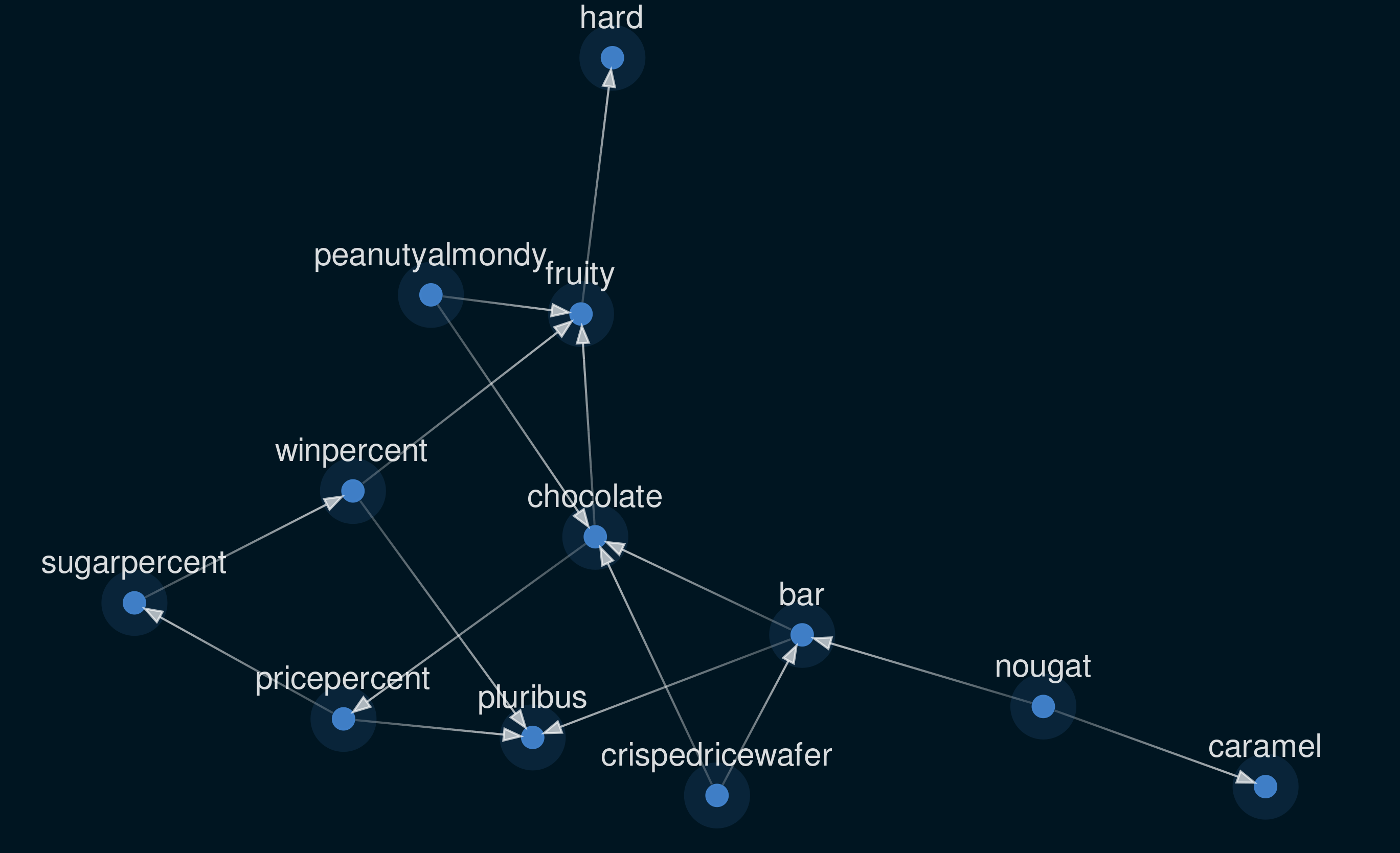
Figure 2: The structure learned from candy dataset using NOTEARS.
So what is this structure telling us? Well, to assign causality to or from the majority of the variables in this dataset makes little sense. Is being a bar the reason a candy is chocolatey? No, they are simply correlated. Yet a proposed arrow of causality has been drawn between ‘bar’ and ‘chocolate’. Arguably, the only variables that can be causal endpoints are ‘winpercent’, ‘sugarpercent’, and ‘pricepercent’, with all others being independent factors. At this point we could include some domain knowledge by manually updating the graph. However, I think that the outcome of structure learning like this is cool, so I’m going to leave it for now.
Discretising continuous variables
Bayesian Networks in CausalNex support only discrete distributions. Any continuous features, or features with a large number of categories, should be discretised prior to fitting the Bayesian Network. We write a function to make numeric features categorical by binning them into ‘n’ bins. For example, a continuous variable may be discretised into three bins corresponding to low, medium and high values.
def discretise(data, n):
    return pd.qcut(data, n, range(n)).astype(int)
n_bins = 3
data['sugarpercent'] = discretise(data['sugarpercent'], n_bins)
data['pricepercent'] = discretise(data['pricepercent'], n_bins)
data['winpercent'] = discretise(data['winpercent'], n_bins)
Training
Like many other machine learning models, we will use a train and test split to help us validate our findings. However, the entire dataset must be used to specify all of the states that each node can take.
from causalnex.network import BayesianNetwork
model = BayesianNetwork(structure)
model.fit_node_states(data)
After this we can train the network on a randomly chosen 80% of the data. We use a Bayesian estimator for this.
from sklearn.model_selection import train_test_split
train, test = train_test_split(data, train_size=0.8, test_size=0.2)
model = model.fit_cpds(train, method='BayesianEstimator', bayes_prior='K2')
Evaluating
Let’s see how we did! We can now make predictions based on the test data using the learnt Bayesian Network. For example, we want to predict if a candy is chocolatey given the state of all other variables. The ground truth values in the test data can be viewed like this:
test_variable = 'chocolate'
truth = test[test_variable]
print(truth)
77    1
34    0
44    0
20    0
3     0
16    0
71    0
73    0
31    0
10    1
83    0
57    0
67    0
76    1
58    0
12    0
42    1
The model’s predictions for these data points can be obtained like this:
predictions = model.predict(test, test_variable)
print(predictions)
77    1
34    0
44    0
20    0
3     0
16    0
71    0
73    0
31    0
10    1
83    0
57    0
67    0
76    0
58    0
12    0
42    1
These values mostly match, meaning our model was able to predict the chocolatiness of previously unseen candy types!
report = classification_report(model, test, test_variable)
print('The accuracy of the model is:', report['accuracy'])
The accuracy of the model is: 0.9411764705882353
Final evaluation
As a final result, we can plot the Reciever Operating Characteristics (ROC) curve for the binary classification of each of ‘chocolate’, ‘fruity’, and ‘pluribus’, given the other variables.
roc = roc_auc(model, test, test_variable)[0]
sns.lineplot(*zip(*roc))
plt.savefig(f'roc_{test_variable}.png')
To reduce noise in these curves, each was calculated 1000 times with a different training / testing split of the data and retraining the model from scratch. The area under the ROC curves give us confidence in our model’s performance.
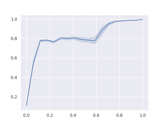
Figure 3: The ROC when predicting ‘chocolate’
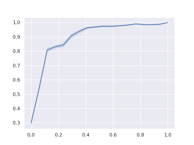
Figure 4: The ROC when predicting ‘fruity’
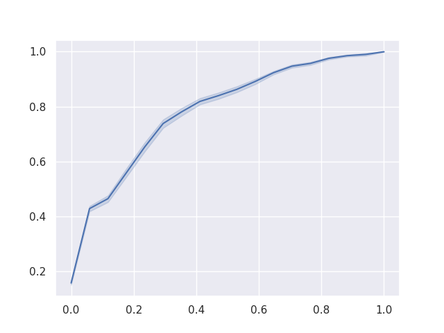
Figure 5: The ROC when predicting ‘pluribus’
Conclusion
A Bayesian network would probably not be the right choice of model for this data in a realistic application, but it’s Nodevember and DAGs have nodes. This method could also have been improved by applying domain knowledge to the structure model. Regardless, the model showed reasonable predictive power, especially considering how little time it took to train.